MENU
Close

16-03-2023

Transformation of Neuron at TU/e: From Computer Center to Hub

Niels Janssen
Account Manager
Share this article:

This article, written by Eva Vroom in Dutch is automatically generated so may contain errors. Featuring photography by Jannes Linders, was published in Pi in September 2023.

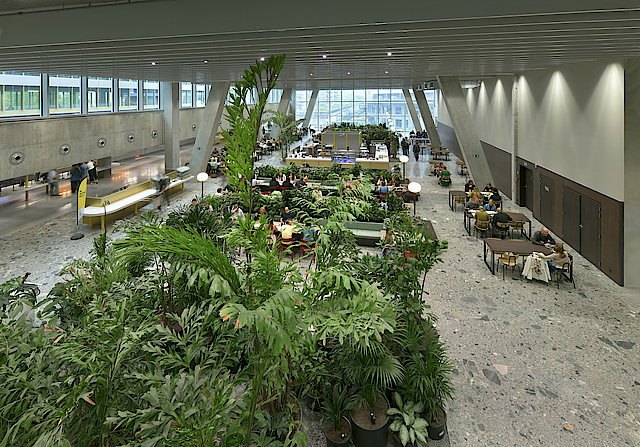
Neuron is located on the campus of TU Eindhoven and dates back to 1972. The building, designed by architect Jacques Choisy, was originally intended to house the very first computers. It combines a sturdy concrete base with a transparent floor made of steel and glass. It has been repurposed into an educational facility, offering approximately 12,330 square meters of space for two large lecture halls, multifunctional classrooms, smaller group spaces, and around 650 study spots. Additionally, it houses the Eindhoven Artificial Intelligence Systems Institute (EAISI).

A building for people

To facilitate this new purpose, the building has undergone renovations with great respect for its distinctive elements; these have been preserved as much as possible or reimagined in a contemporary context. The result is a layered design that pays homage to and enhances the original architecture. This achievement owes much to the interior, a collaboration between Team V and interior design firm MüllerVanTol.

"Team V Architecture has beautifully transformed Neuron from a computer facility into a space for people," says Bas van Tol. "They had already devised the interior layout, and we were tasked with materialization and furniture design. When I first saw the building, I immediately knew we could play a significant role in it. I have a special connection with these modernist structures. They readily lend themselves to alternative uses, being open and non-prescriptive. Our most successful interior projects have been realized within buildings from that era.

The first floor is divided into three sections, each of which received its own color scheme for the custom interior.


Choreography of a Landscape

Neuron is one of the lower buildings on the campus, with a pleasant human scale and a lot of variation between high and low, light and dark, natural light and artificial light. Particularly striking is the contrast between the robust trumpet columns on the ground floor and the slender construction of the upper floor. Van Tol says, 'By extending the building's materialization into the interior, users can easily connect with the space. The building's inherent design of the fixed furniture is a natural extension of the architecture. For example, we applied CLT wood from the atrium structure in all the custom furniture.'


The ground floor of the building has been largely preserved and now houses lecture halls, smaller educational and group spaces, the Neuron Lounge, and a central meeting area. Van Tol explains, 'This area serves as a kind of plaza that connects the lecture halls. To create a pleasant environment, we designed an installation of beams here that you can sit, lean, and hang on. I always try to imagine the possibilities of a space. Sometimes it's more approachable to stand somewhere rather than sit next to someone. We see the interior as a landscape. Before designing furniture, we draw the building-defined space in elevations in which we visualize only silhouettes of people in different postures and potential uses. These choreographies inspire the furniture we design. We've created a lot of custom furniture for Neuron.

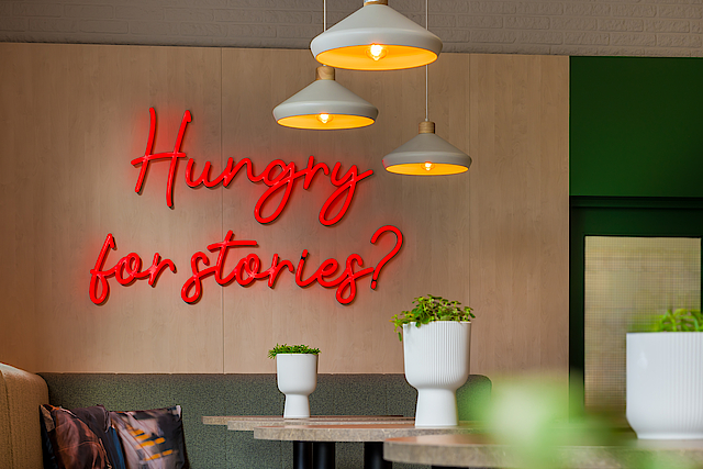
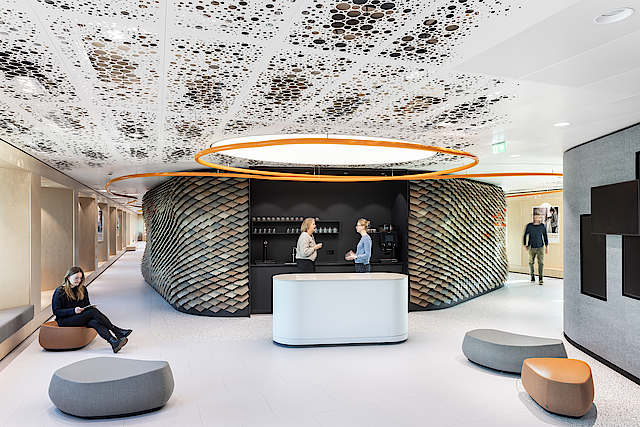
The 'Neuron Lounge' is partially furnished with vintage furniture to signify it as a place for meetings and relaxation. Thanks to the illuminated signage, the lounge is easily visible from the campus.


Neuron Lounge

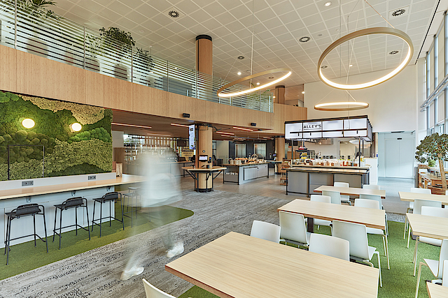
In addition to meeting areas, MüllerVanTol also designed touchdown areas, workspaces, and study spaces, shaping the rooms according to the concept of noise – hum – tranquility," says Van Tol. "How you make the difference between noise, hum, and tranquility recognizable has a lot to do with material choices and careful alignment. Interior design can encourage specific behaviors." The building includes zones for interaction, collaboration, and concentration, distinguished through design, layout, and materialization. "The educational spaces received standard loose furniture, while the meeting and circulation zones have a more building-integrated design, such as the suspended patio tables, façade benches, and 'Neuron' stools. Transitions between different functional areas, including the entrance to the quiet study areas and the entrance to EAISI, are emphasized with custom furnishings. In areas where noise is permissible, we used marmoleum on the floors, while in quieter sections, we used Bolon flooring. Touchdown areas are designed more simply than areas where people linger, like the Neuron Lounge."

The latter is located at the new main entrance that Team V created to improve the connection to the campus. "There is an axis running between the buildings on the campus that leads to Neuron. TU/e also wanted a gathering place in the building. We named this space the 'Neuron Lounge' and marked it with large ceiling-hung neon letters to make it attractive from the outside. We've made the lounge special; it is partially furnished with vintage furniture to indicate that it's a place for socializing and relaxation. It has become an inviting space, easily visible from the campus thanks to the illuminated signage.

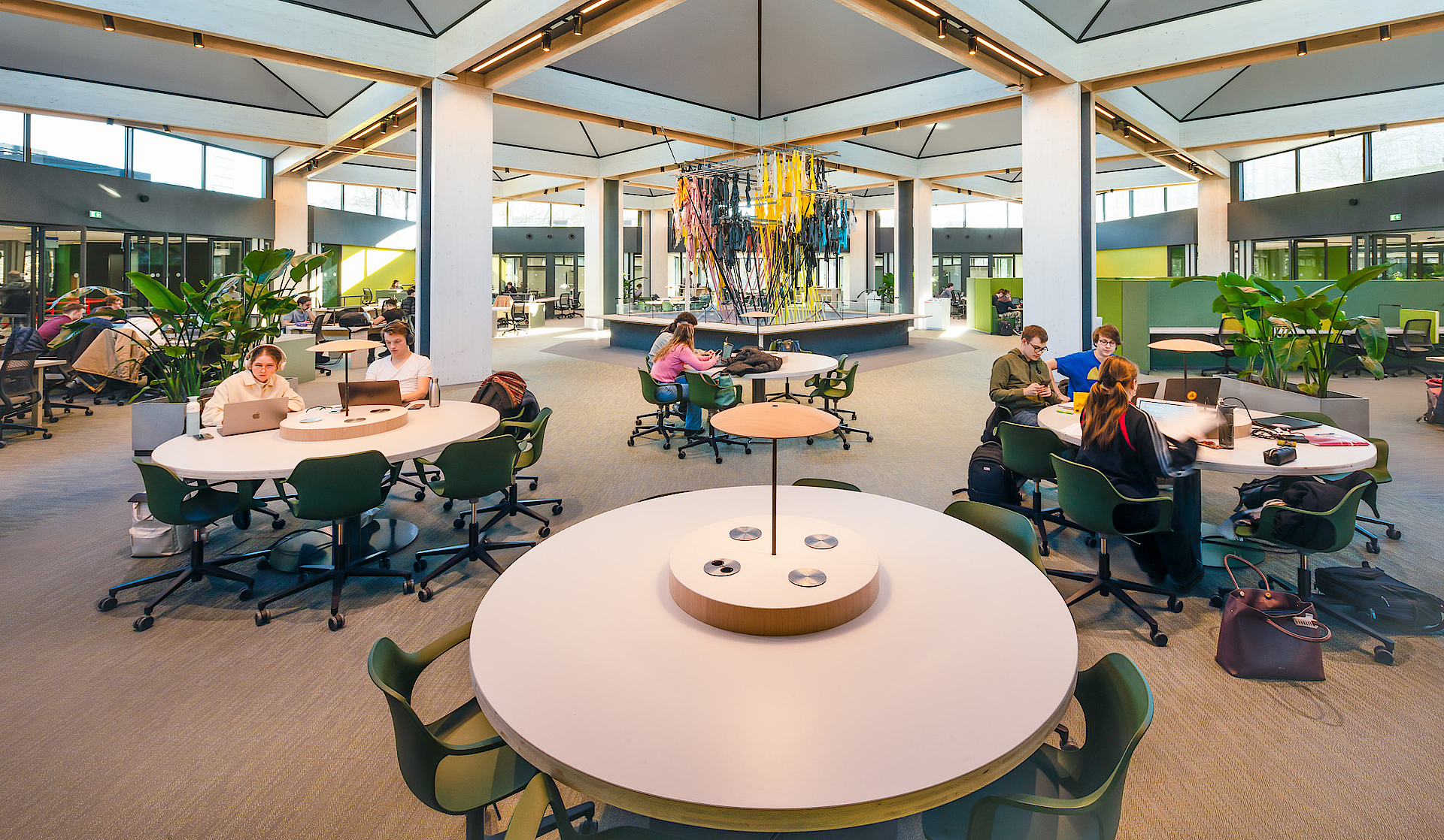
Mezzanine

While the ground floor was largely preserved, the most significant changes took place on the upper floor of the building. Team V stripped the façade and replaced it with new glazing. Façade features like the balconies with their red tube profiles are reintroduced in a contemporary form in the new design to preserve the characteristic interplay between the robust base and the slender superstructure.

The steel columns and the cabinet walls in the corridor were retained, maintaining the original structure's readability. Since the eight open patios on the upper floor did not meet current climate, comfort, and layout requirements, they were covered. For the four central patios, the covering consists of a CLT (Cross-Laminated Timber) structure that extends above the roof level. A mezzanine connects this section to the meeting area on the ground floor, bringing light and spaciousness into the heart of the building. In the mezzanine hangs the 'Loom Room' installation by Jongeriuslab, in line with TU/e's tradition of integrating art and architecture on campus. Around this mezzanine, touchdown areas have been created. To the left is the domain of EAISI, and to the right is the zone with quiet study areas. Each of these three areas has its own color palette for custom furniture: greens were chosen for the central area, a combination of blue and green for the quiet area, and a range of red tones for EAISI.

Sustainable materials

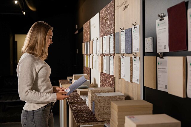
MüllerVanTol pays close attention to color and materialization in every project, including Neuron. Van Tol explains, 'At the start of a project, we create a 'model of insight.' This scale model only presents the space-defining elements that show how the architecture influences the interior. The physical presence of the scale model also serves as a means to discuss the project with various disciplines within our studio. Textiles, texture, and color are designed by Christiane Müller's team. We develop material structures for the project market and have an extensive materials library, which continues to evolve.'

In the interior design for Neuron, the alignment with the building goes beyond aesthetics to include materials and colors. 'We used sustainable materials such as CLT and Marmoleum, and recycled materials for upholstery. Christiane Müller is the design director at Vescom, and we incorporated their responsible fabric collection into the material palette. The gray tones used for Neuron's interior complement the concrete of the structure. The choice of greens, among other reasons, reflects the surroundings – there is a beautiful garden on the campus. The accent color red is derived from the existing building.'

This careful integration of the interior with the architecture enhances the building's unique qualities and gives the design a high degree of unity and naturalness. Users find this naturalness pleasant and enjoy spending time in Neuron," says Van Tol. "It has become a popular place."


Client — Eindhoven University of Technology
Architect — Team V Architecture
Interior Design — MüllerVanTol
Interior Construction — Gielissen Interiors | Exhibitions | Events
Furniture — Ahrend, Arper, Sedus, Vitra, Pastoe
Vintage Furniture — Morentz, Deja Vintage
Flooring — Forbo Flooring, Bolon
Installation — 'Loom Room' by Jongeriuslab
Contractors — Bouwbedrijf Berghege, Heerkens van Bavel Bouw, Croonwolter&dros, TBI
Gross Floor Area — 12,330 m2


Share this article: